Seasonal Wardrobe Selection
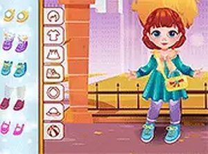
Players choose from a range of tops, bottoms, and full dresses that evoke the crisp feel of fall. Items like knit sweaters, corduroy pants, and flannel shirts appear in earthy tones. The selection emphasizes comfort and warmth, with each piece designed to layer naturally. A simple tap or click adds an item to the character, and the outfit updates instantly on screen.
Hairstyle and Accessory Pairing
After selecting clothing, players pick a hairstyle that suits the overall look. Options include short cuts, pigtails, and longer styles, all with a soft, child-friendly appearance. Accessories such as beanies, scarves, and small backpacks complete the ensemble. The game encourages trying different combinations to see how each element changes the final appearance.
Instant Feedback and Exploration
Every selection triggers an immediate visual update, so players see the result of each choice right away. There are no penalties for changing an item or starting over. This design supports open-ended experimentation, letting users spend as much time as they like refining their creation. The interface remains simple, with large buttons and clear icons that even young children can navigate.
Save and Share Creations
A built-in screenshot tool allows players to capture their finished designs. These images can be saved to a device or shared with family and friends. This feature adds a social layer without requiring accounts or online connections. The game works entirely within a web browser, so no software installation is needed on any device.
Visual Style and Atmosphere
Art assets use warm oranges, browns, and creams to create a cozy autumn mood. The toddler character has a friendly, expressive face that reacts subtly to different outfits. Backgrounds feature simple seasonal elements like falling leaves or a soft indoor setting. The overall aesthetic remains calm and non-distracting, keeping the focus on creative expression.
Accessibility and Device Support
The game runs on any modern browser, including those on smartphones and tablets. Touch controls work as smoothly as mouse clicks. A full-screen mode is available for a more immersive experience. The layout adapts to different screen sizes, ensuring buttons remain easy to press on smaller displays. No downloads, registrations, or in-app purchases are required.